The S5 Tab Show can be demo'd on this page. The styling of the module shown here is customized specifically for this template with css overrides, and cannot be used with any other template. The same module can be used on any template, but with default or other styling in its place.
The S5 Tab Show will display up to 20 modules in various styles within sliding tabs, and is compatible with responsive sites. Simply publish the S5 Tab Show module to your desired module position and pages. Then start publishing modules to the positions in the Tab Show (s5_tab1, s5_tab2, etc); these modules will become the slides. This is a great way to organize and showcase your site's content or images. Version 3 of this module is incredibly powerful, below is a list of all of its features.
The S5 Tab Show will display up to 20 modules in various styles within sliding tabs, and is compatible with responsive sites. Simply publish the S5 Tab Show module to your desired module position and pages. Then start publishing modules to the positions in the Tab Show (s5_tab1, s5_tab2, etc); these modules will become the slides. This is a great way to organize and showcase your site's content or images. Version 3 of this module is incredibly powerful, below is a list of all of its features.
- Transitions are powered by CSS3, so no javascript conflicts
- Optional custom classes
- Up to 10 copies of the module on the same pages; each individually controlled
- Use up to 20 slides
- Select on mouseover or on click for activation
- Set the loation of the tabs or arrows
- Center the tabs or arrows
- Hide the tabs or arrows until mouseover
- Force the tabs or arrows to be shown for tablets and mobile devices
- Select your transition effect
- Set your duration speed
- Add extra padding in between slides or no padding at all
- Optional button text for tabs
- Optional images for tab buttons
- Set a background color or image for each slide or the entire module
- Enter pre-text and post-text
This module can be viewed on this page. The styling of the module shown here is customized specifically for this template with css overrides, and cannot be used with any other template. The same module can be used on any template, but with default or other styling in its place. Publish your own content into each slide transition and for multiple slide transition effects, navigation arrows and also a drop down gallery tab that allows you to select a slide via a thumbnail. You can setup your own custom HTML for each slide or have it automatically pull from articles. This module is fully responsive as well. The S5 Image and Content Fader is powered by Mootools/Jquery. Best of all it's free!
Features at a glance
- Pull from custom HTML or articles.
- Responsive layout compatible
- Choose between 4 slide transitions: Fade, Continuous Horiztonal, Fade Slide Left, Continuous Vertical
- Zoom In Option
- Specify height and width of module
- Mobile size options
- Includes a gallery tab drop down to show all images
- Each image slide can have its own hyperlink
- Show up to 10 images at once
- Publish your own content to each picture slide
- Navigation arrows
- Not all slides require titles
- Change delay time
- Hide or show: Navigation arrows, thumbnail carousel and popup text
I like what I see! I want to JOIN TODAY.
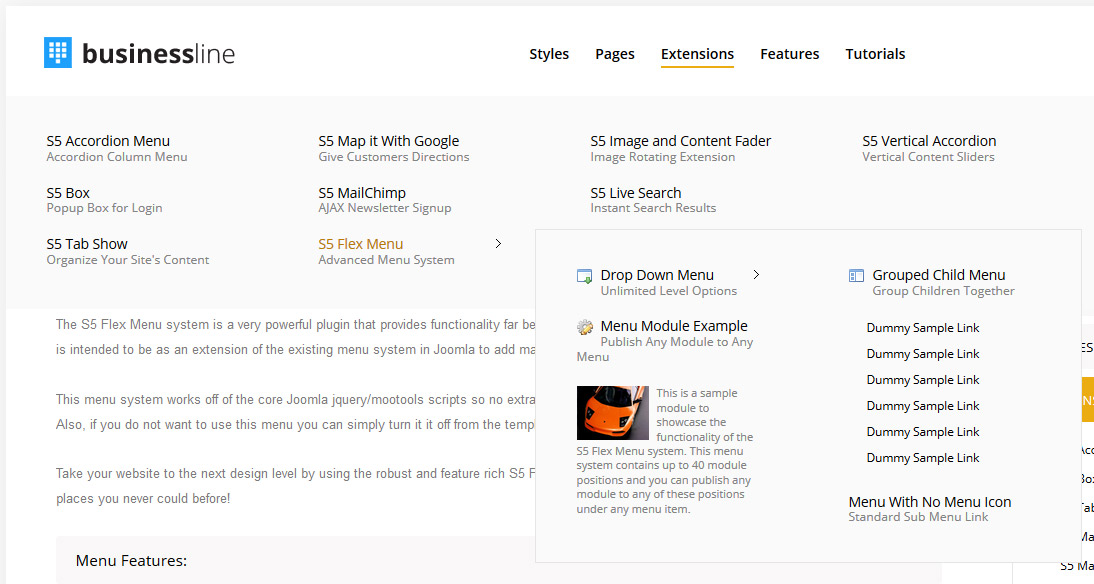
The S5 Flex Menu system is a very powerful plugin that provides functionality
far beyond what the standard Joomla menu system can provide. This plugin
is intended to be as an extension of the existing menu system in Joomla to add many new features! Please see the full list of features below.
This menu system works off of the core Joomla jquery/mootools scripts so no extra javascript library is needed and keep download sizes to a minimum. Also, if you do not want to use this menu you can simply turn it it off from the template configuration page.
Take your website to the next design level by using the robust and feature rich S5 Flex Menu System. Organize your links with ease and show content in places you never could before!
Menu Features:
- Automatic onclick functionality for tablet sized touch screens. If a device's screen is detected as touch screen and is of table size, then the menu will function with an onclick method rather than the onmouseover effect that is shown on a laptop or desktop that has a mouse for use.
- Multiple javascript effects such as fade, slide, etc.
- Multiple columns for menu items or modules.
- Modules load directly into the menu.
- Group sub menu items into the same column or fly out.
- Optional sub texts for each menu item.
- Optional menu icon images for each menu item.
- Automatic multi-language menu change. If you are setting up a multi-language site, the flex menu will automatically change if your site's visitor has a language specific menu setup for their language in the menu manager.
- And much more!
Menu Screenshot:

I like what I see! I want to JOIN TODAY.


